MATHFINDER
Cross-platform mobile application prototype intended to help users find the right math app to suit their needs.
UNIVERSITY
ROLE
Graduate Student | M.S. in HCI
TIMELINE
Jan 2018 - Dec 2018
TOOL
Figma • CanvasFlip • Typeform
KEY
UX Design • UX Research • Affinity Diagramming • Contextual Inquiry • Personalized Recommendation • Persona • Usability Study
ABOUT ROCHESTER INSTITUTE OF TECHNOLOGY (RIT)
Founded in 1829, the Rochester Institute of Technology (RIT) is a diverse, collaborative community of engaged, socially conscious, and intellectually curious minds.
The B. Thomas Golisano College of Computing and Information Sciences encourages experiential learning, including professional practice and engagement in research and scholarly activities. Faculty and students advance the computing and information sciences fields through a robust scholarly agenda focusing on computing foundations, emerging technologies, interdisciplinary applications, and user-centered design of computing-based solutions to effectively address challenges individuals, organizations, and global society face.
PROBLEM STATEMENT
The burgeoning growth of smartphones and tablets has increased demand for mobile applications that fulfill varying purposes. With the current mobile revolution, there is a growing demand for incorporating mobile technologies and applications as part of the educational prism to help facilitate the learning process for users of all ages.
While the multitude of mobile applications available today spoils users for choice, their sheer number also results in acute information overload, making it challenging to identify the relevant and desired apps.
GOAL
This project was dedicated to designing and evaluating a unique cross-platform mobile app prototype – MathFinder. This app stands out for its exceptional ability to filter existing math apps based on topic, grade, platform, rating, device, and cost. These features make it a valuable tool for teachers and individual users, addressing the challenge of finding the right math app.
The MathFinder app prototype was meticulously designed with a user-centered approach, ensuring that it caters to the specific needs of its users. By filtering existing math apps based on topic, grade, platform, rating, device, and cost, it primarily focuses on assisting teachers in finding relevant apps for their students. However, it is also a valuable tool for individuals seeking an appropriate math app for themselves.
USER-CENTERED DESIGN & RESEARCH METHODS
Contextual Inquiry
Affinity Diagramming
Sequence Models
Personas
Use Cases
Wireframing
DISCOVERY
I. Contextual Inquiry
A contextual inquiry was conducted with 2 participants:
- P1: A 39-year-old female teacher looking to find relevant math apps for her students.
- P2: An 18-year-old male college student looking for an appropriate math app for himself.
The basic idea was to understand the process of finding the desired math apps in app stores regardless of the mobile device platforms and identifying the setbacks in the process. Every person has different priorities and personal preferences regarding downloading apps, and the contextual inquiry helped gain insight into these factors.
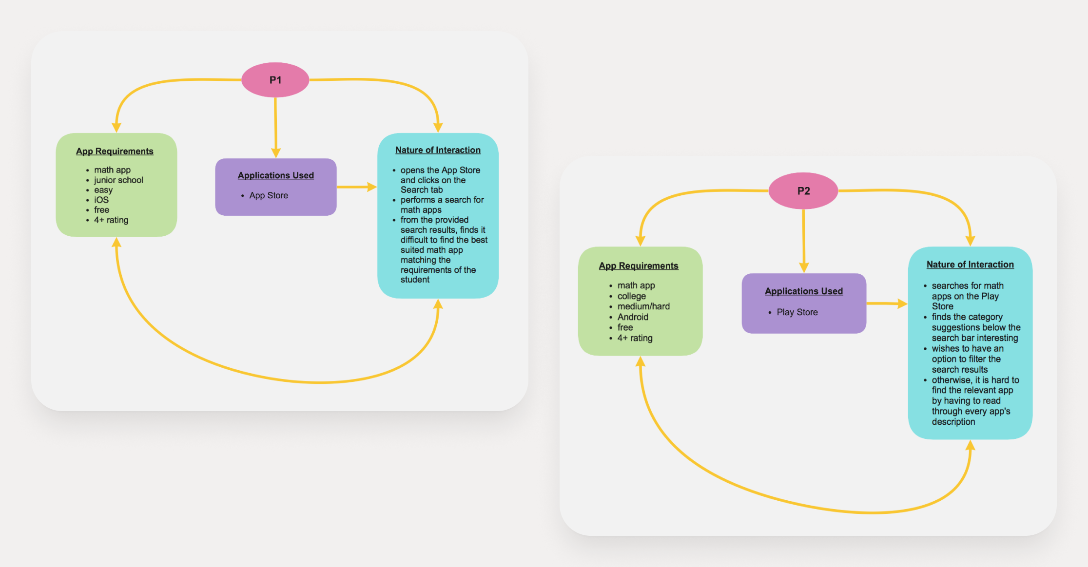
II. Flow Models
Flow models were used to illustrate the path a prototypical user took to complete a particular task on the app.
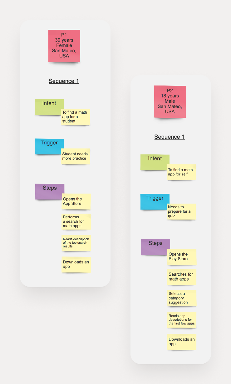
III. Sequence Models
Sequence models consist of ordered steps of actions taken by a user to do their work. It was used to indicate a user's trigger for doing a particular job and their intent and to identify the sequence breakdowns.
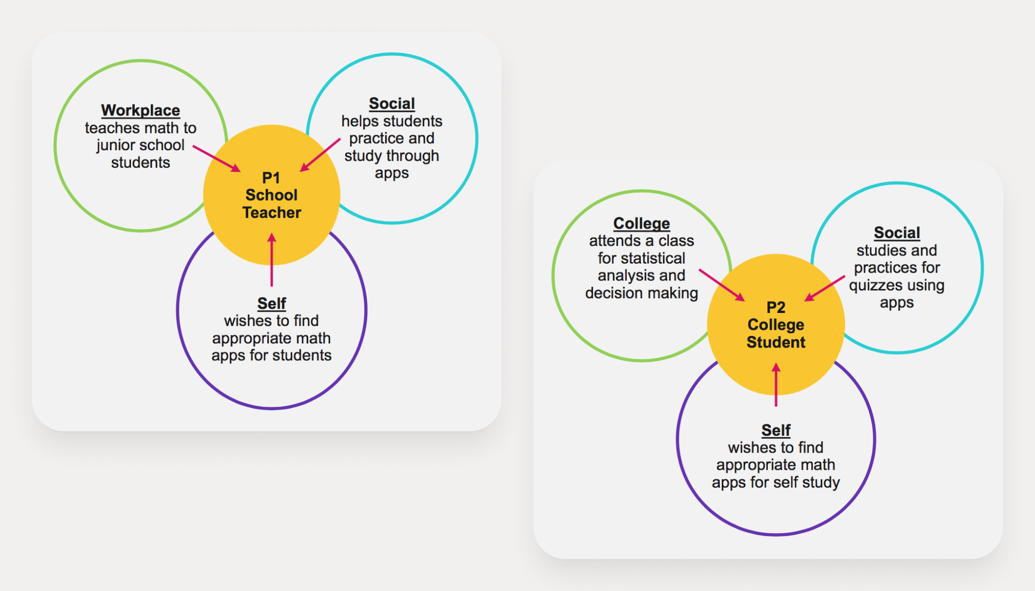
IV. Cultural Models
Cultural models demonstrate how and where users work in a cultural context.
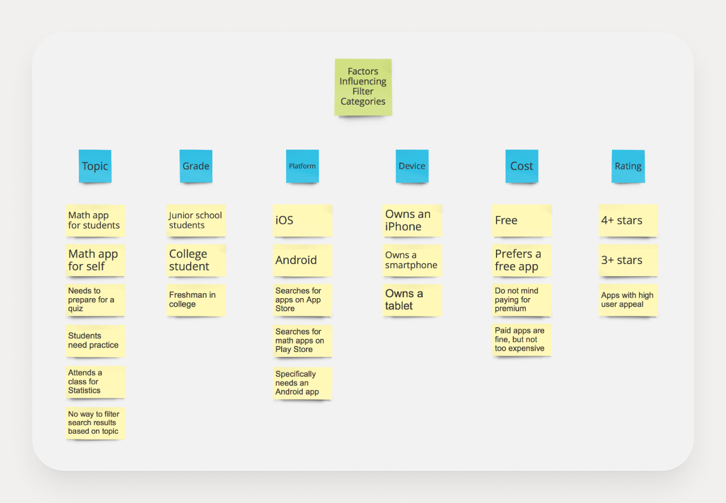
V. Affinity Diagram
An affinity diagram, a method of organizing and analyzing large amounts of data, was used to gather opinions, ideas, and issues collected from the contextual inquiry and field study. This diagram helped to identify common relationships or themes among the data, providing valuable insights into the needs and preferences of the target audience.
SOLUTIONING & DESIGN
I. Personas
Persona creation was the method of humanizing tasks by creating specific users to perform those tasks while using the product.
II. Use Cases
Use cases helped describe a sequence of actions performed by an actor within the system to accomplish a particular objective. They were used to compare and contrast varying contexts of use against other cases.
III. Low-fidelity Wireframes
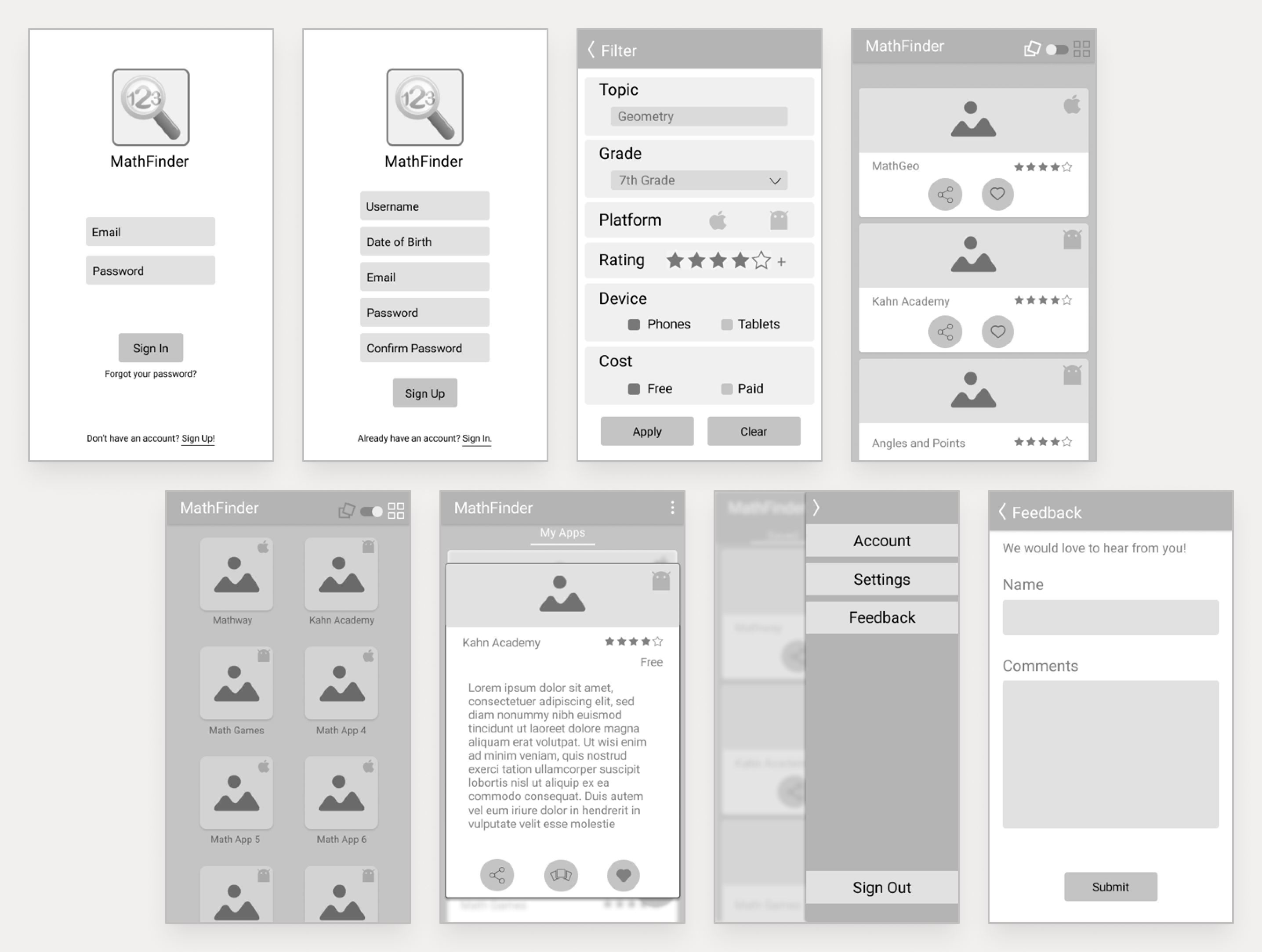
Low-fidelity wireframes were designed using Figma to sketch the target prototype's key characteristics and broad concepts. It also helped map out the static screens, information architecture, and user interface shell.
IV. High-fidelity Wireframes
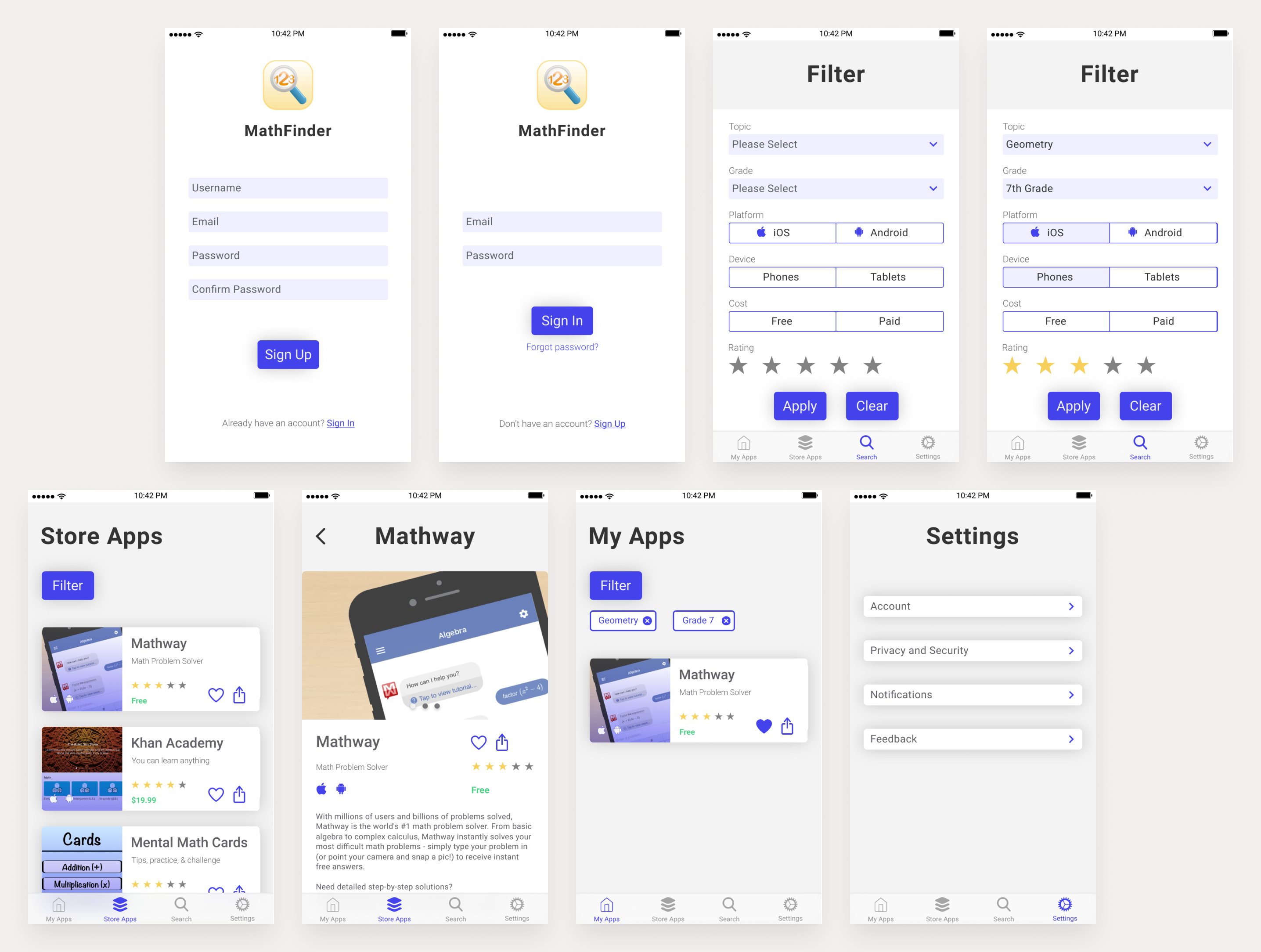
High-fidelity wireframes were also designed using Figma to simulate system functionality and design. The interactive click-through prototype was tested using CanvasFlip.
USABILITY STUDY
The usability study was an exploratory process involving six male and female participants aged 18-50 years. Test sessions were conducted using CanvasFlip, an online real-time usability testing tool for mobile/web prototypes. The study aimed to identify usability issues, evaluate the app's performance, and understand the needs and expectations of the target audience.
Each test session lasted less than an hour, requiring each participant to perform three tasks. The test sessions consisted of four subparts – pre-test arrangements, introduction to test session, test session, and post-test debriefing.
The primary goals of the usability study were to:
- Find usability issues and their potential solutions.
- Evaluate what was working, what needed improvement, the missing features, if any, and how the app could drive more traffic.
- Understand the expectations and needs of the target audience.
- Analyze the complete user experience.
- Assess the social aspects – perception, appeal, and interaction behavior.
- Identify the cues that convey the quality of the product and interactions.
KEY FOCUS AREAS
- Were the provided filter categories adequate for finding the desired math apps?
- How easily could users perform the tasks?
- Was the user interface first-use intuitive and aesthetically pleasing?
DATA COLLECTION & EVALUATION
Qualitative data was collected throughout the usability study to address the research questions. A datasheet was maintained to track participants' task sequences, successes, and failures in achieving the particular task goals and their overall performance. Two evaluation measures were considered - qualitative metrics and preference data.
I. Qualitative Analysis
The following helped evaluate participants' understanding of the functions and their attitude towards the overall experience of the application:
- Positive comments about app features.
- Negative comments about app features.
- Comments on the overall feel and experience.
- Suggestions for improvement.
II. Preference Data
The following helped evaluate participants' experience of using the MathFinder prototype while performing the particular task scenarios:
- Learnability of the app functionality.
- Rating the aesthetics, layout, and navigation of features in the app.
- Mapping the appropriateness of functions with users' perception of and expectations of the functions.
KEY FINDINGS & TAKEAWAYS
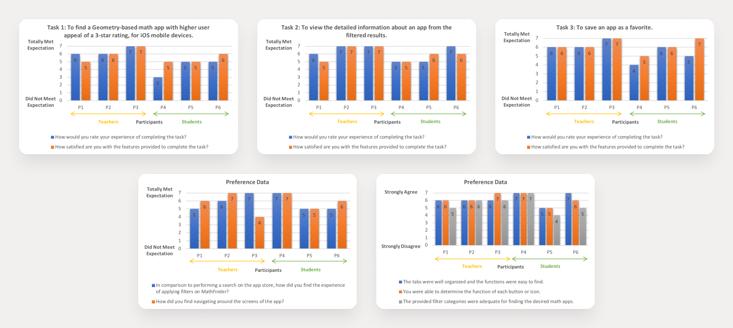
Participants were required to answer a post-task questionnaire at the end of each of the three study tasks and a post-test questionnaire at the end of the study. These questionnaires were designed to gather participants' feedback on their experience with the MathFinder prototype, consisting of 7-point Likert scale survey questions.
The responses to these questionnaires provided valuable insights into the participants' understanding of the app's functions and overall experience.
100%
Task Completion Rate
0.23 min
Avg. Task Completion Time
7
Avg. Interactions per Task
CHALLENGES
A few finalized participants were unavailable on their scheduled days, and ultimately, the usability study had to be conducted with backup participants.
We made deliberate efforts to recruit participants from a mixed age group of 18-50 years, as well as a diverse background - whether they teach or study themselves or use an iOS, Android, or Windows mobile device. This diversity in participants ensures that the app is designed to cater to a wide range of users, enhancing its usability and appeal.
LEARNINGS
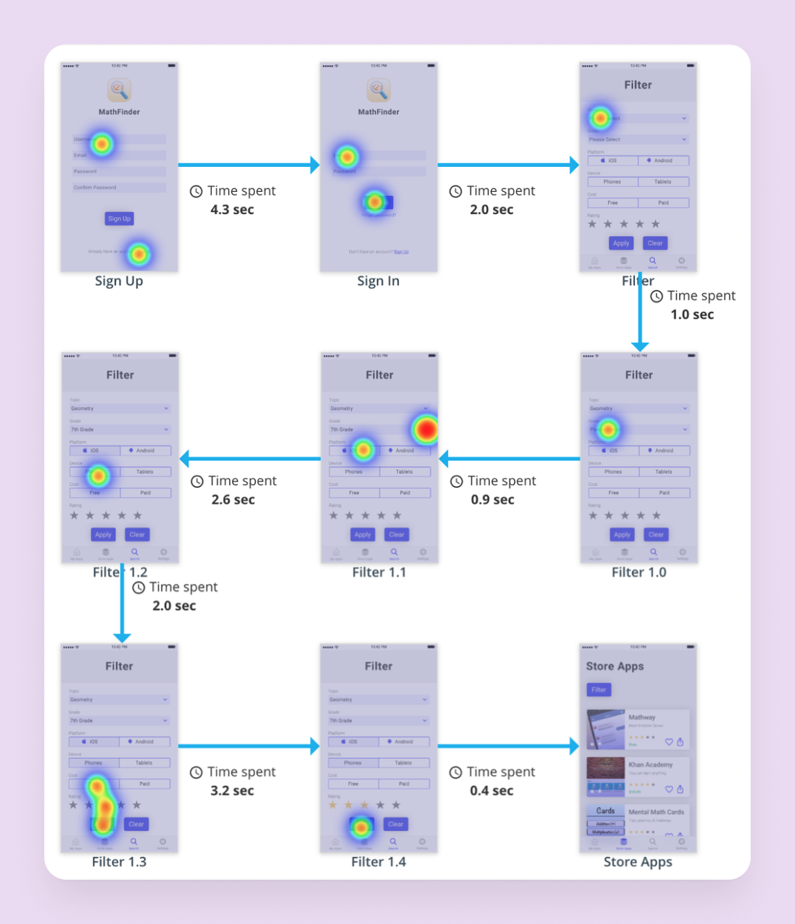
User flows showed the paths the prototypical users or participants took on the high-fidelity click-through prototype of the MathFinder app to complete the particular task scenarios. Interactions took participants from their starting point toward a successful outcome.
The heat maps, which visually represented the most common areas of participants' interactions across various screens, were used to identify patterns in user interaction. By aggregating user behavior, heat maps gave an at-a-glance understanding of user interaction with individual screens, thus identifying patterns to optimize for further engagement.
By aggregating user behavior, heat maps gave an at-a-glance understanding of user interaction with individual screens, thus identifying patterns to optimize for further engagement.
User Flow & Heat Map
"The best way to predict the future is to create it." – Peter Drucker
Let's shape the future together!
CONNECT
© 2025 Aishwarya Singh